

Article: What a High-Converting Coaching Website Actually Looks Like

What a High-Converting Coaching Website Actually Looks Like
Most coaching websites are beautiful.
Soft colors. Calm imagery. Elegant fonts.
And yet — they don’t convert.
If your website gets compliments but not inquiries, it’s not because your offer isn’t strong or your coaching isn’t valuable. It’s because your website isn’t doing the job it was built for.
A coaching website isn’t just a digital business card.
It’s a decision-making space.
In this guide, we’ll break down what high-converting coaching websites actually do differently, why most sites quietly lose potential clients, and what to look for if you’re ready to upgrade your online presence without rebuilding everything from scratch.
Why Most Coaching Websites Don’t Convert
The biggest mistake coaching websites make isn’t design.
It’s misplaced focus.
Most coaching websites are built around:
-
The coach’s story
-
Aesthetic minimalism without structure
-
Generic messaging
-
Endless scrolling with no clear direction
While these elements look good, they don’t guide visitors toward a decision.
A potential client doesn’t arrive on your site asking:
“Is this coach talented?”
They arrive asking:
“Do they understand me — and can they help?”
If your website doesn’t answer that question within the first few seconds, visitors quietly leave — even if they love your work.
What High-Converting Coaching Websites Do Differently
High-converting coaching websites are calm, intentional, and deeply client-focused.
They don’t rush.
They don’t push.
They guide.
Here are the core elements they all share.
1. Clear Positioning Above the Fold
Within the first screen, a visitor should immediately understand:
-
Who the site is for
-
What transformation is offered
-
Whether this coach is relevant to them
This doesn’t mean loud headlines or sales language. It means clarity.
Confusion kills conversion — calm clarity builds it.
2. Emotional Context Comes Before Credentials
Most coaches lead with experience, certifications, and background.
High-converting websites lead with emotional recognition.
Before someone cares who you are, they want to feel:
-
Seen
-
Understood
-
Safe
Your credentials matter — but only after connection is established.
3. Visual Calm Paired With Strong Structure
Minimalism alone doesn’t convert.
High-performing coaching websites combine:
-
Soft, neutral visuals
-
Clear content hierarchy
-
Intentional spacing
-
Strategic repetition
The result is a site that feels calm and purposeful — not empty or vague.
4. A Guided Path (Not Endless Scrolling)
Visitors shouldn’t have to figure out what to do next.
High-converting websites gently guide users through:
-
Understanding
-
Trust
-
Exploration
-
Action
This can be as simple as:
-
Clear section breaks
-
Repeated call-to-actions
-
Visual cues that create momentum
When users feel guided, they stay longer — and convert more often.
5. Reassurance Without Pressure
Coaching is an intimate investment.
Strong coaching websites:
-
Normalize hesitation
-
Remove pressure
-
Offer reassurance through tone, layout, and pacing
When a website feels calm, visitors feel safe enough to take the next step.
Examples of Coaching Website Layouts That Convert
Seeing these principles in action makes everything click.
Below are examples of coaching website layouts designed specifically to support conversion — without aggressive marketing or pushy tactics.
Each of these layouts is built to:
-
Highlight the offer clearly
-
Guide visitors naturally
-
Support trust and emotional safety
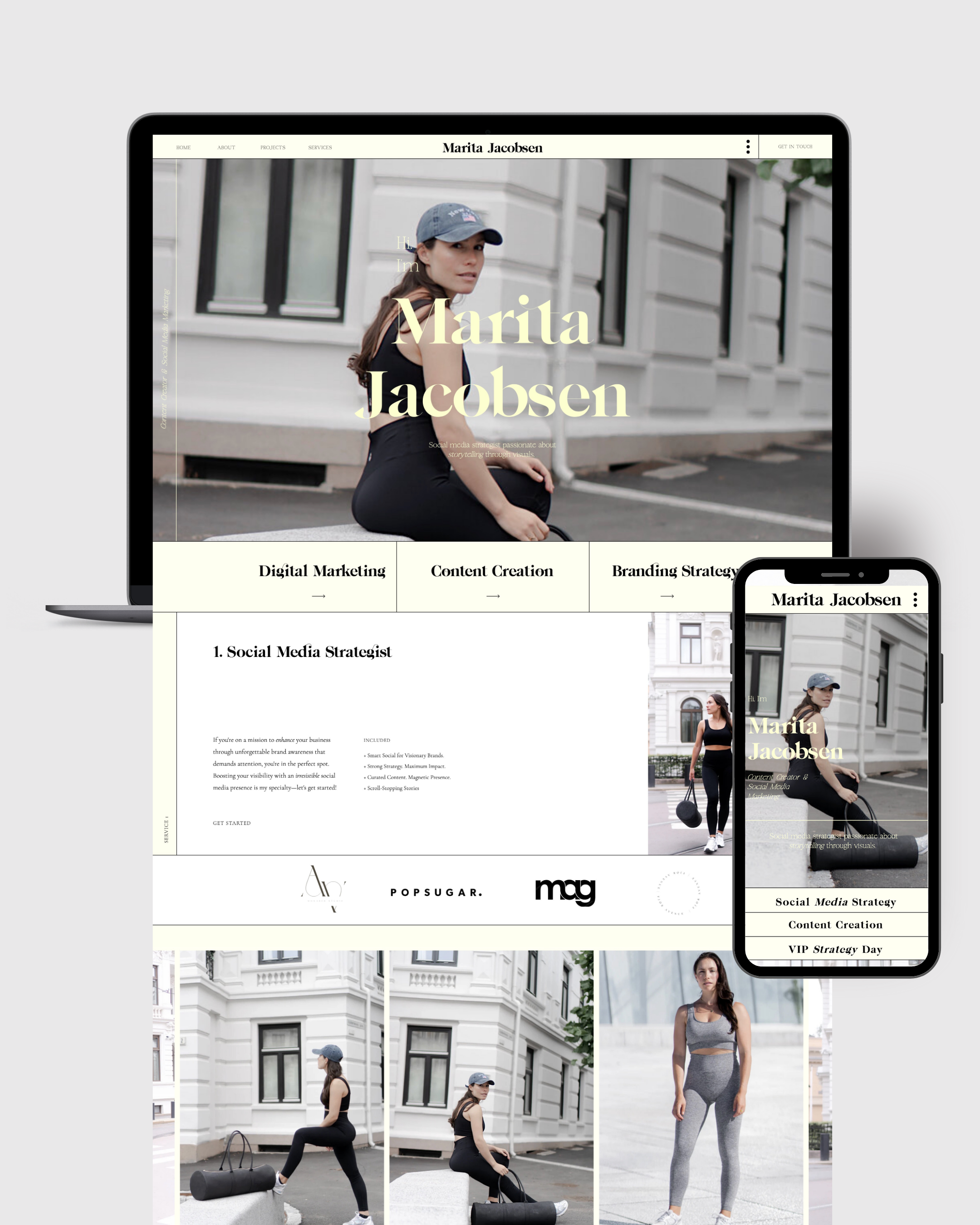
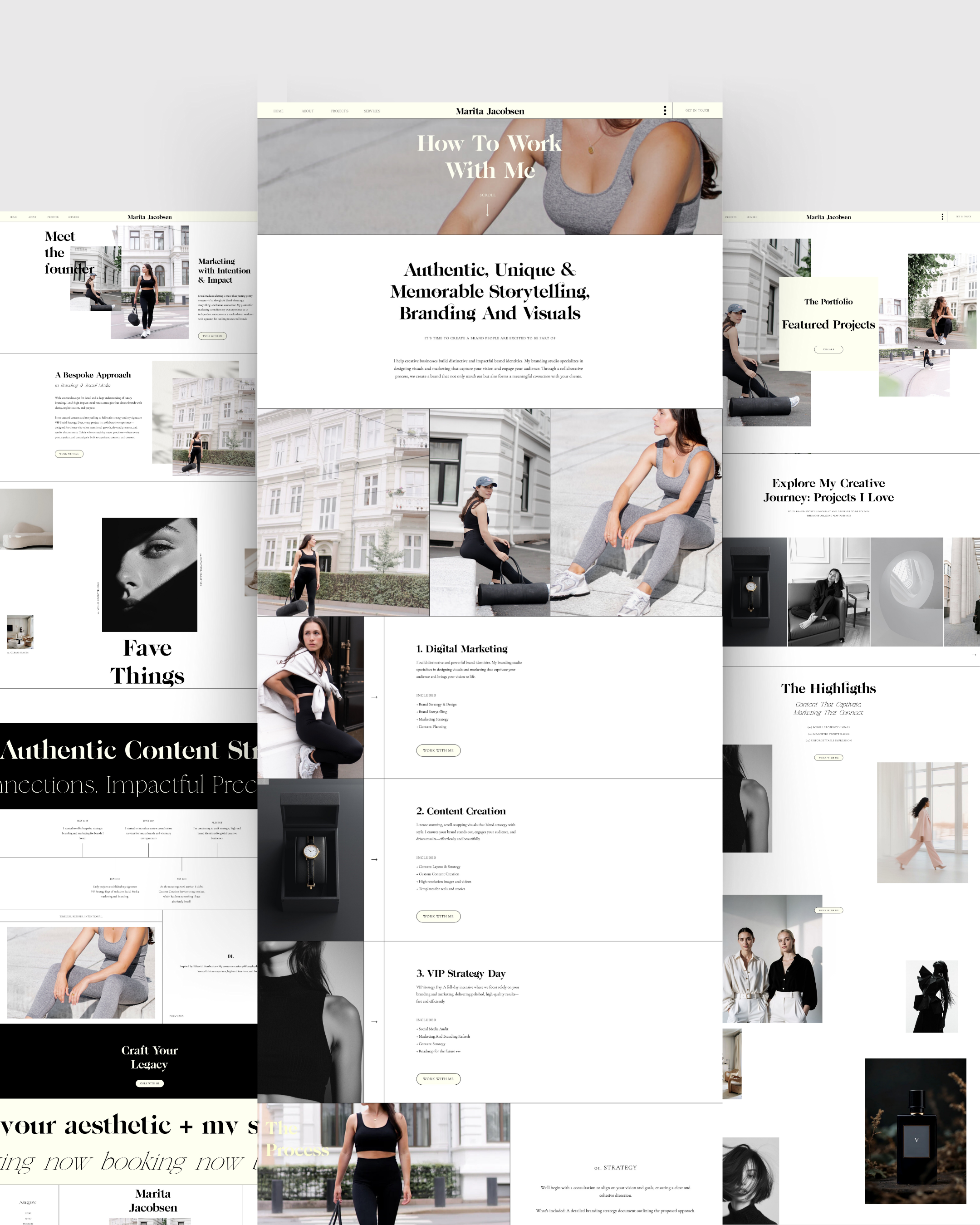
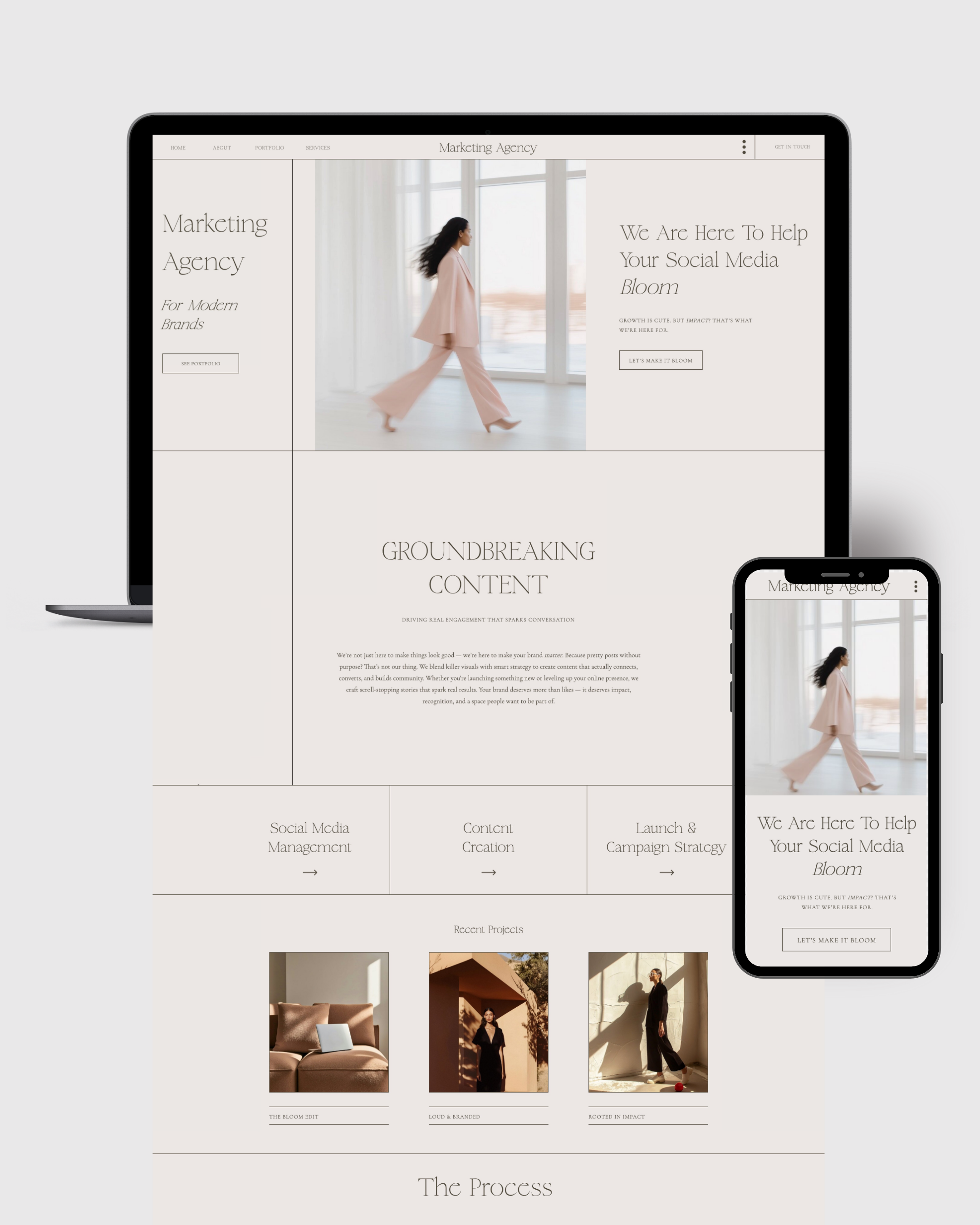
Emily Coaching Website Template
A soft, editorial layout ideal for coaches who want warmth, clarity, and a grounded presence.
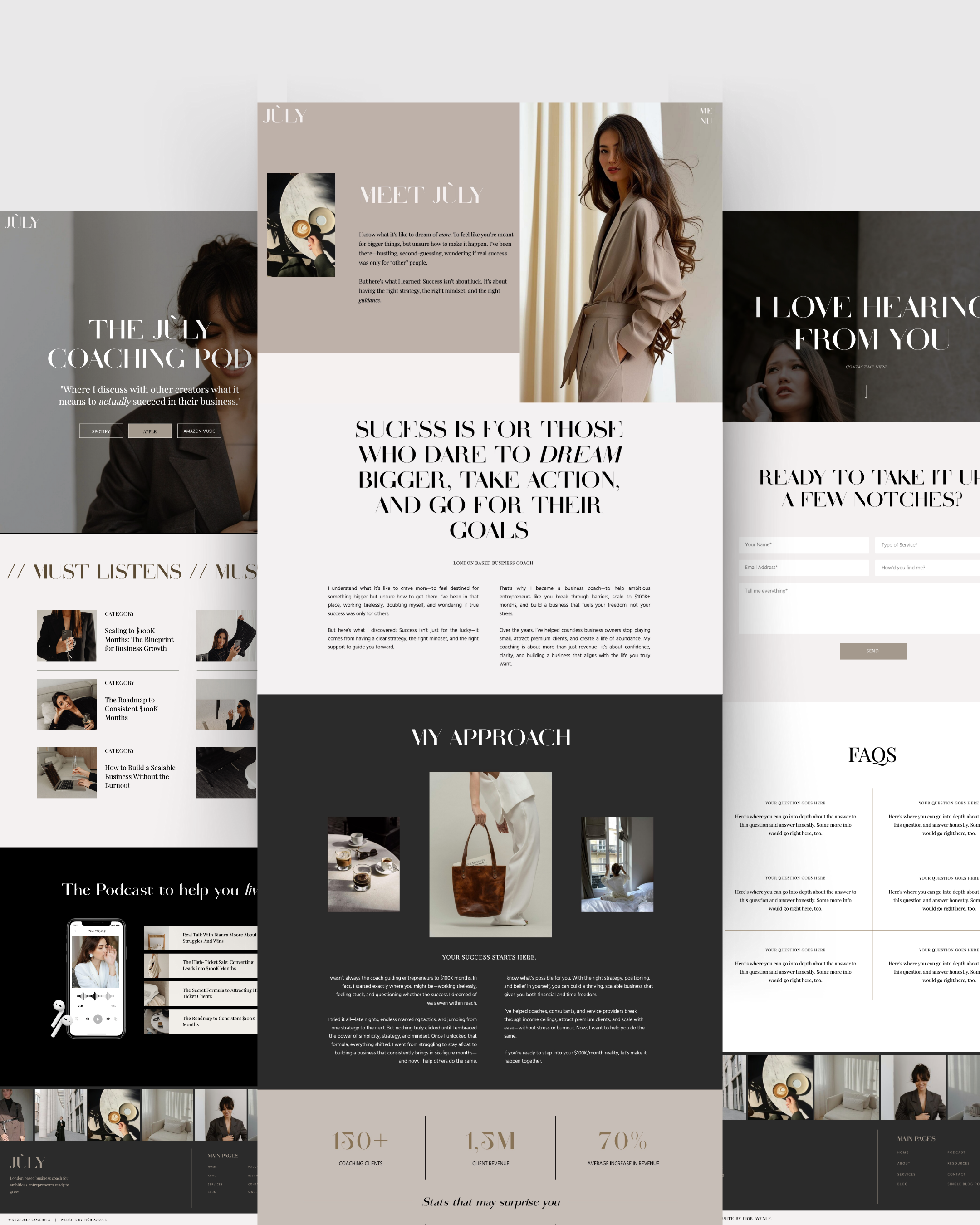
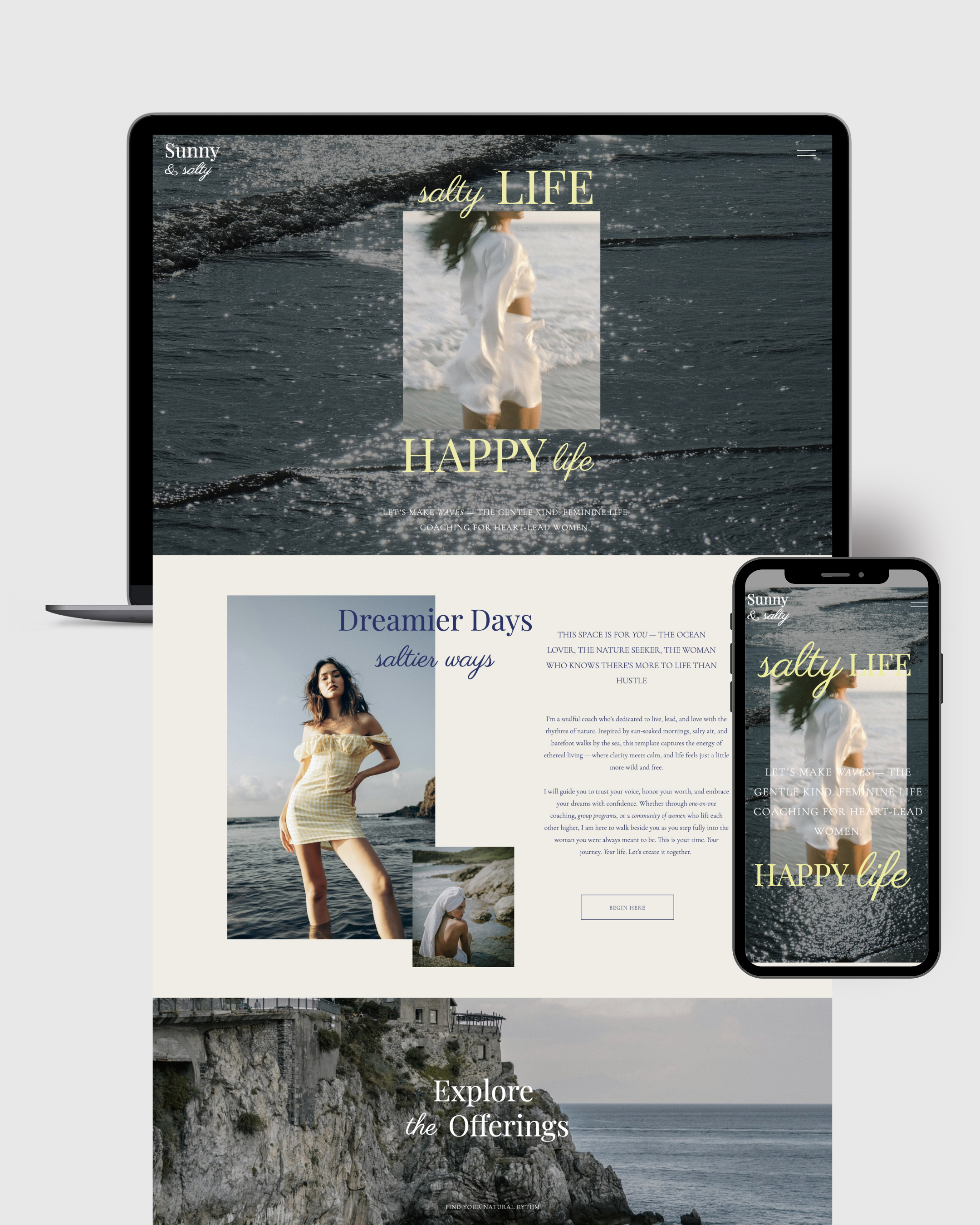
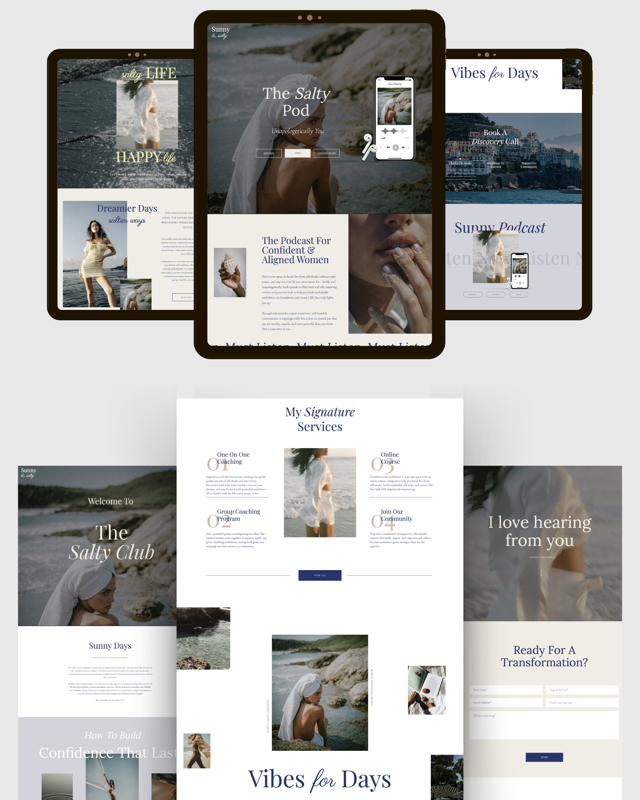
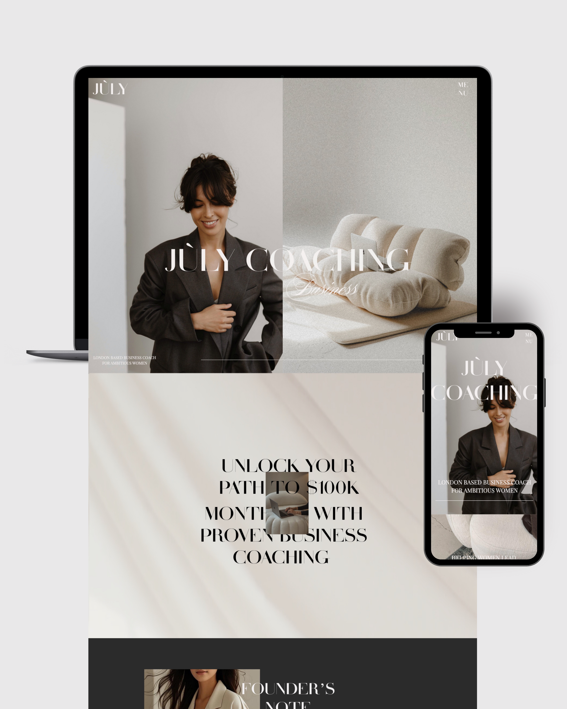
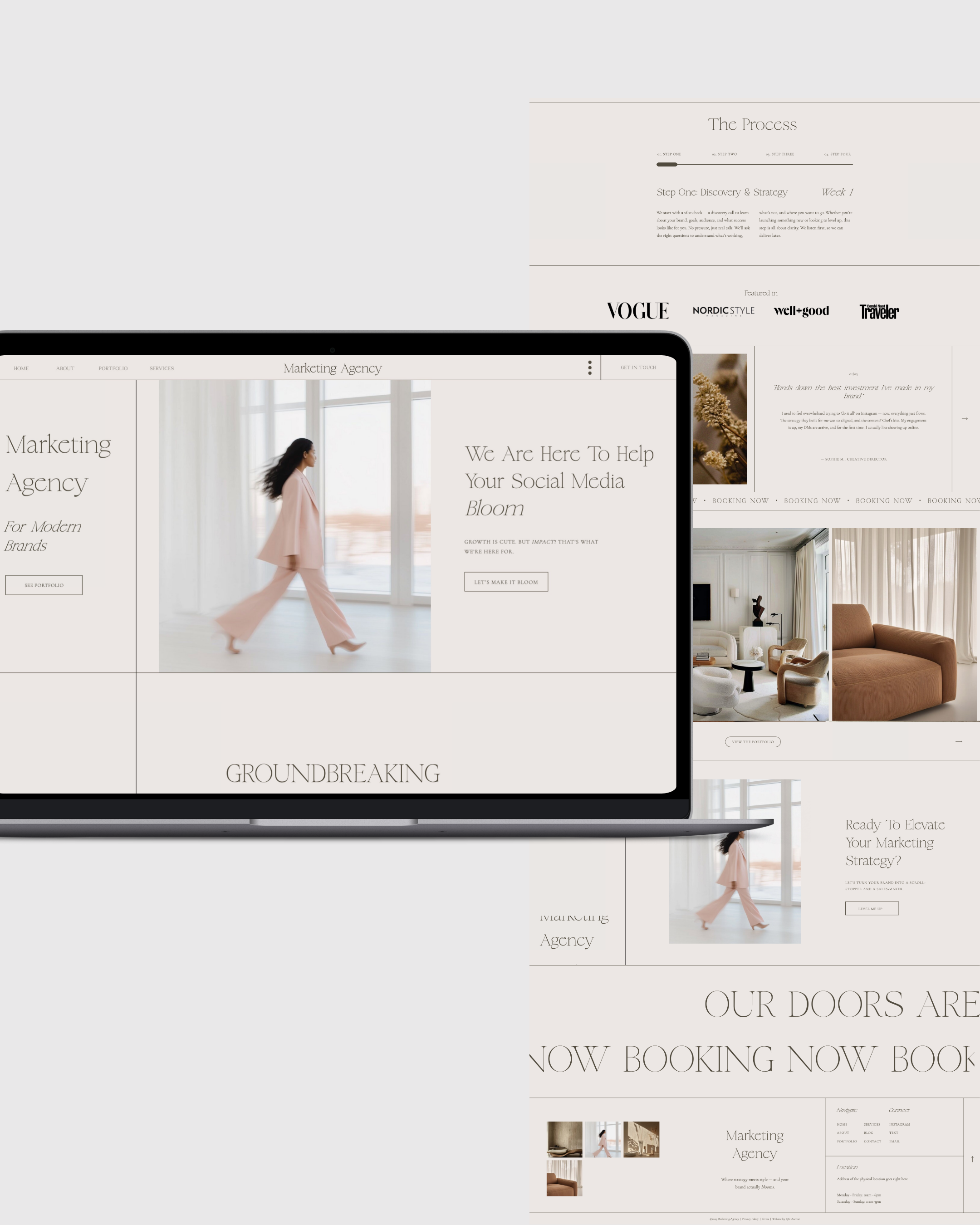
July Coaching Website Template
Minimal, modern, and spacious — perfect for coaches who value calm authority and refinement.
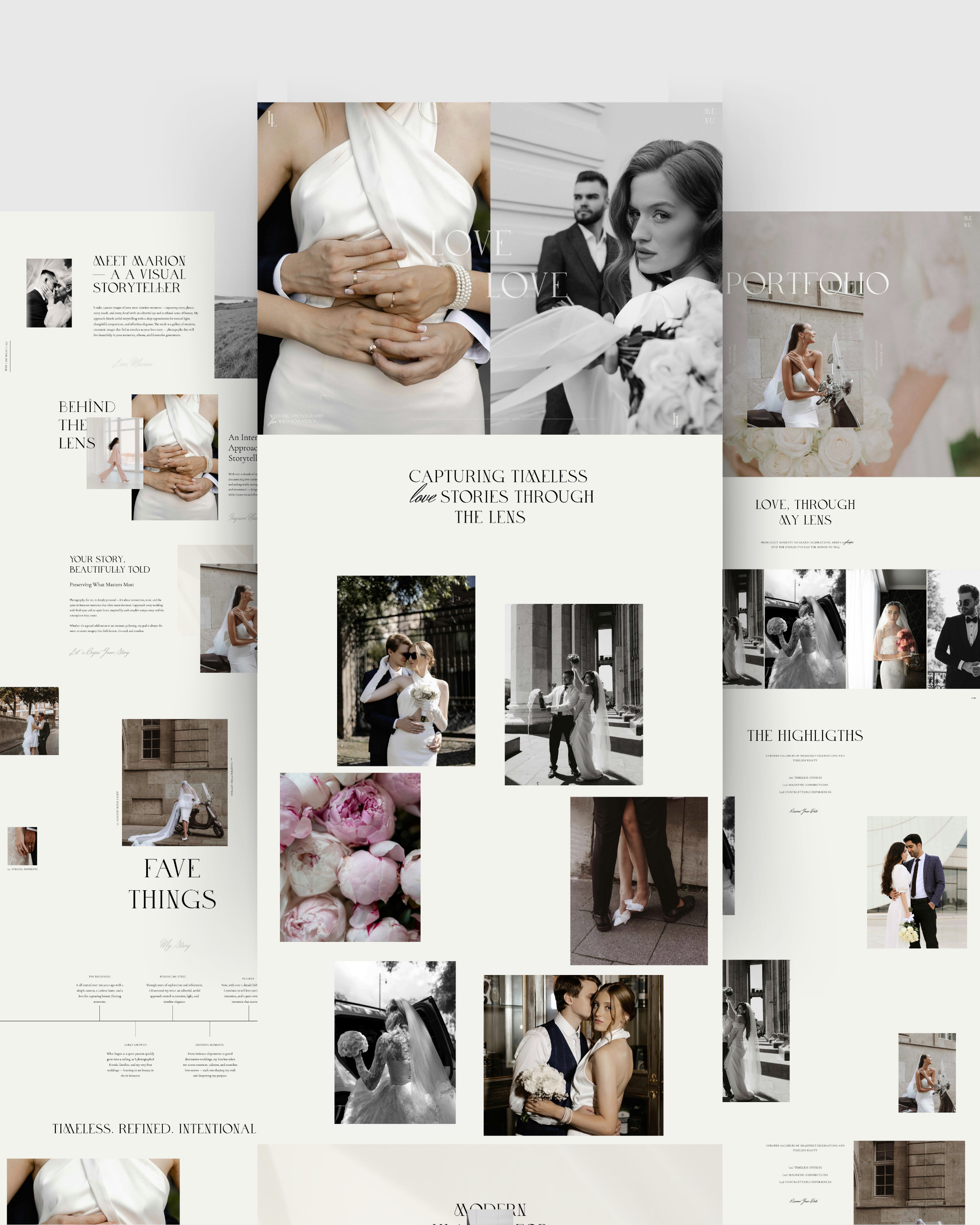
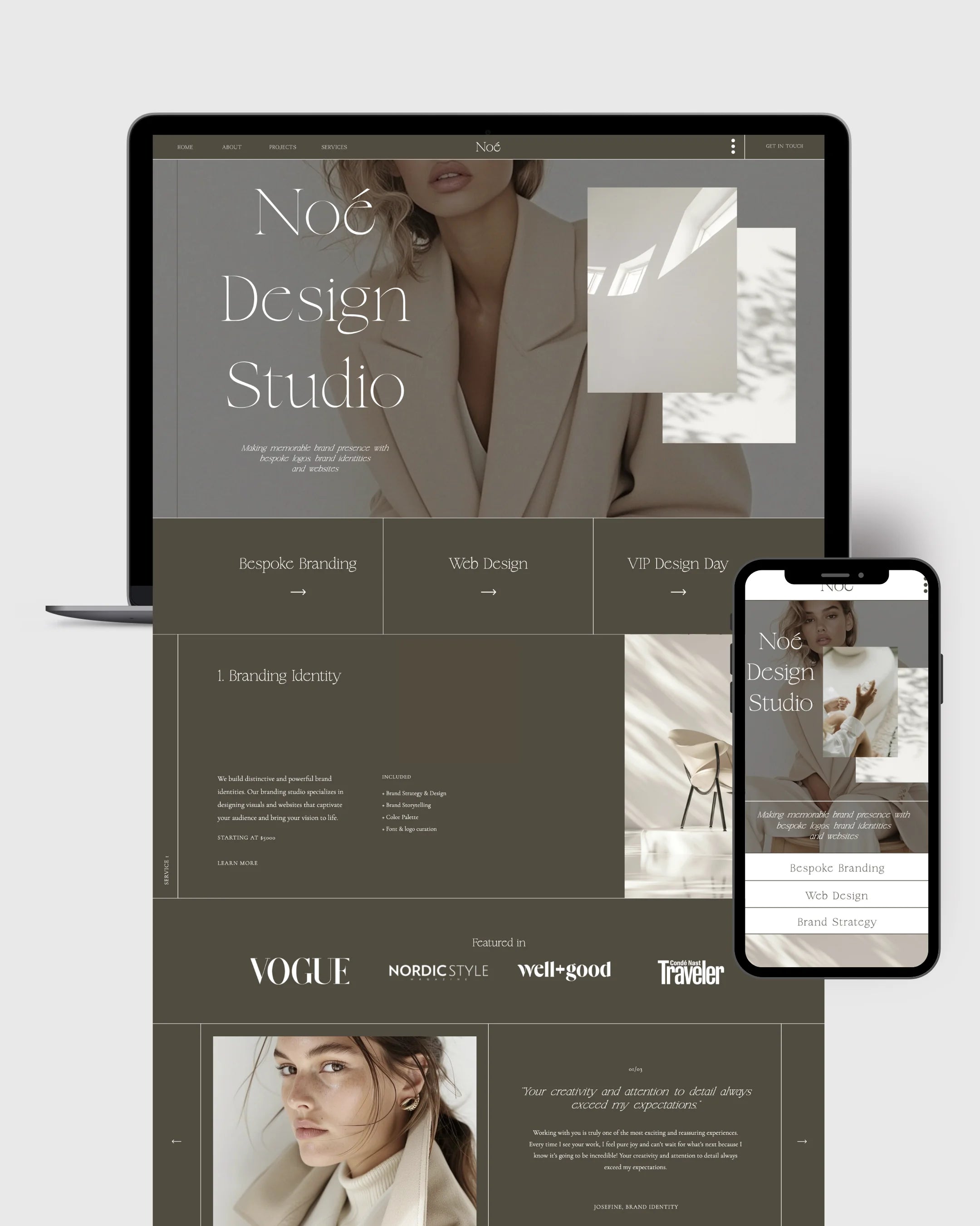
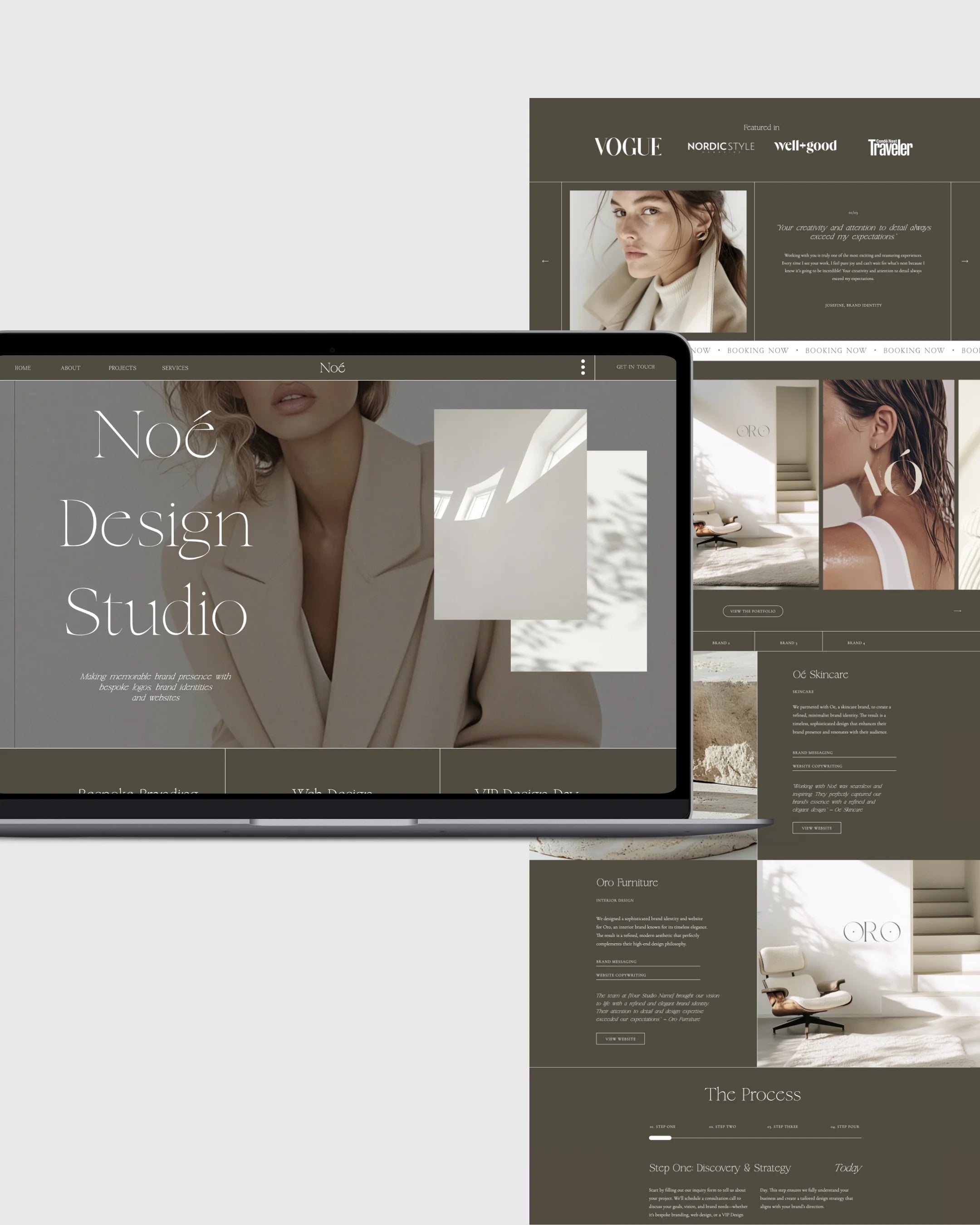
Loire Coaching Website Template
A sophisticated, conversion-focused layout for coaches who want elegance without complexity.
Each template is fully customizable in Showit, allowing you to adapt colors, fonts, imagery, and messaging to your unique brand — without starting from zero.
Why Showit Works So Well for Coaching Websites
Showit is especially well-suited for coaches because it allows full creative control without technical overwhelm.
With Showit, you can:
-
Design visually, not with code
-
Adjust layouts freely
-
Create emotional flow through design
-
Focus on message and presence instead of tech
A coaching website should feel like an extension of your work — not another task on your to-do list.
Do You Need a Custom Website to Convert?
Not necessarily.
Custom design is powerful — but it’s not required to create a high-converting website.
If:
-
The structure is already optimized
-
The layout supports clarity and flow
-
The design is intentionally built for your audience
Then a thoughtfully designed template can perform just as well — often faster and with far less friction.
Templates allow you to focus on:
-
Your message
-
Your offer
-
Your business growth
Instead of getting stuck in endless design decisions.
Ready to Upgrade Your Coaching Website?
If your current website feels:
-
Pretty but passive
-
Calm but unclear
-
Beautiful but quiet
It may be time for a layout that actually supports your work.
Explore our curated collection of Showit website templates designed specifically for coaches — created to help you show up with clarity, confidence, and ease.
👉 Explore Coaching Website Templates
Not Ready Yet?
That’s okay.
Start by browsing layouts.
Notice what feels aligned.
Pay attention to what creates a sense of relief instead of pressure.
The right website doesn’t push you forward — it gently supports you there.


